
Getting started with Analyst's Notebook
Welcome to this introduction and overview of Analyst's Notebook.
Analyst's Notebook Desktop is a standalone Visual Analysis application that is used globally to help make complicated data easier to understand by bringing it into a visual format.
It provides tools for users to establish possible connections, create hypotheses and to inform their next actions.
It's used within many different sectors for lots of different purposes, with origins in policing.
Getting Started Video
You can link to the video and view it full screen here.
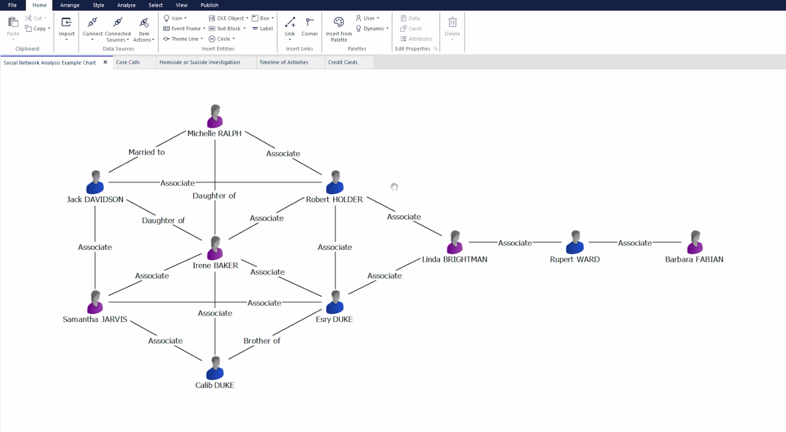
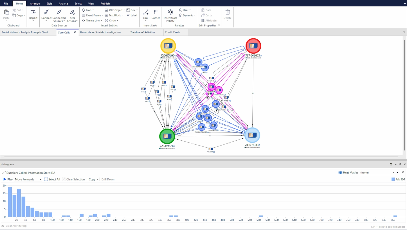
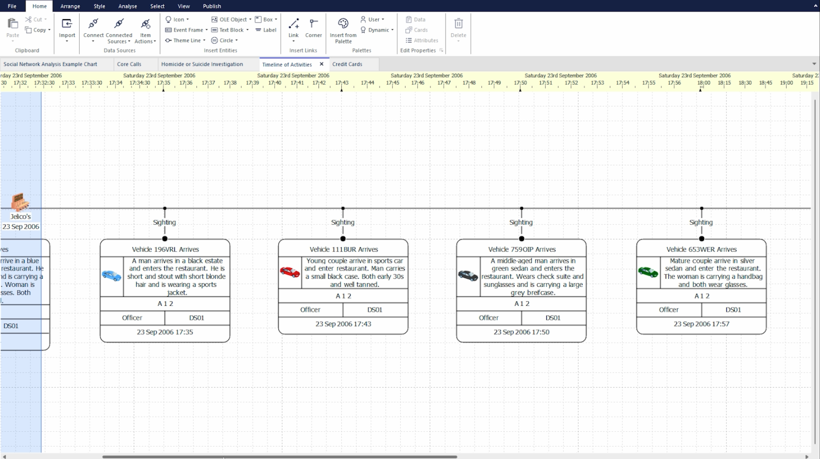
Charts
The basis of presenting information in Analyst's Notebook Desktop is done through Charts which are the tabs within the application where you can add information, move or arrange data and perform analysis.
When opening the application for the first time you will be presented with a blank chart that you can then add to and expand on.
You can create a new chart tab either by using the new tab option in the UI or by using the keyboard shortcut CTRL+N.
Charts can be created, stylized and arranged in many different ways. Below are some examples of potential charts and layouts that have been created in Analyst's Notebook Desktop.
You'll find further information about Charts here.
Entities
The Icons that can represent countless different bits of data that make up the different charts are referred to as Entities.
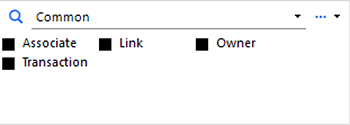
The simplest way to start adding Entities onto your chart is by using the Palette area which is normally open by default when you open the application, if not, you can open it using the Insert from Palette button in the Home Tab.
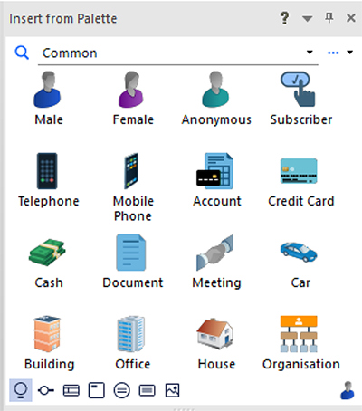
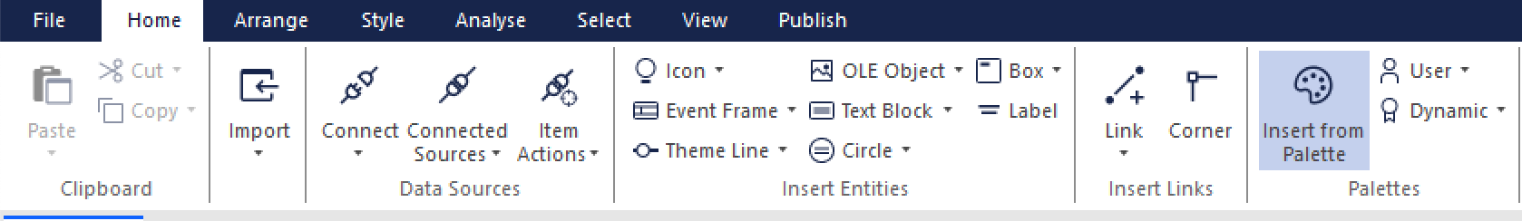
You can drag and drop the Entities in this section onto the chart area to add them to your chart or you can click once on the icon and then click again on the chart where you would like the Entity to be added.
You can choose different categories from the drop-down menu in the palette area to change the different entity types that are available to you to suit the data or information you're looking to work with.
Entities on the chart can be moved and edited on the chart, if you double click on an Entity you will open a pop-up menu that allows you to edit the properties and add more information connected with that Entity as well as the option to change the default image to a custom image from your file system.
You'll find further information about Entities here.
Links
Once you have a good number of Entities on your chart, in order to visualize how they are connected or what joins them together you can use what we call Links. These are the lines drawn between Entities that can also house information and data.
As with adding Entities, Links are added from the section below where the Entities are found in the Palette area, you can click on a Link type which will change your cursor's appearance to a crosshair and then click on the two Entities you want to link. You can also click and hold from a link to one Entity, which will then give you the connecting line to click another entity and complete the link.
As with the Entity types you can use the drop-down menu to select different link types as needed.
You can also double-click a link to edit its properties in the same way as Entities.
Links will automatically adjust their positioning if you move entities around on the chart so you can try different layouts and structures without losing the connections you've created.
You can explore and change the style, direction and connection strength of Links by clicking the Style Tab and using the options in the Link Style section.
You'll find further information on Links here.
Importing
Manually adding data through the Palette area is a way of easily creating simple charts but when it comes to dealing with data that concerns hundreds of different entities and potentially thousands of different links that connect them, Analyst's Notebook desktop offers the ability to import data.
Importing allows you to take data from files such as CSV or Excel, bring them into Analyst's Notebook, and have the data mapped to entities and links so that you can review the data in a visual analysis form.
One of the ways of doing this is by creating an Import Specification which is a file that defines how the application should interpret incoming data and present it on a chart. Import Specifications and how to create them are discussed in more detail here.
Importing this way means you have the capability to take hundreds of cells or lines of text in one file format and be able to look at it in a brand new way. Importing can account for date and time information as well as identify how entities can be linked together. You can then perform further analysis on the data within the application.
Import Specifications can also be shared with other users so if you're working with similar or identical data you would all be able to work with the data in Analyst's Notebook in the same way.
As a note, no data that is imported into Analyst's Notebook is being saved elsewhere or uploaded anywhere, the application is standalone and your instance is unique to you.
You'll find further information on Importing here.
Analysis Tools
When you have a lot of data on a chart it can seem overwhelming to try and establish hypotheses, or identify which areas you should be focusing on. This is where the Analyze Tab comes into play.
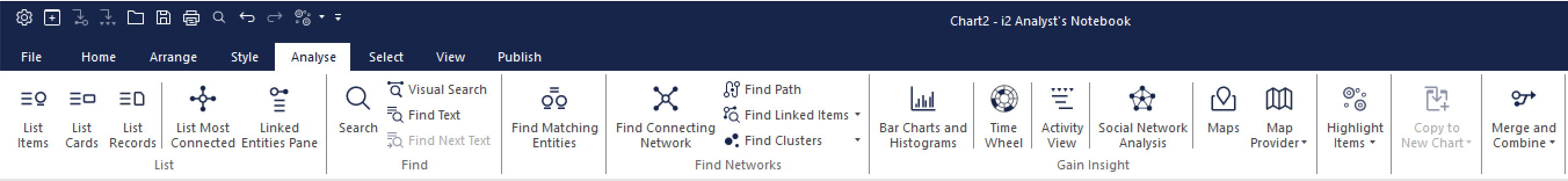
The Analyze tab contains lots of different tools and ways of interpreting and understanding data on your chart. You'll find information on all of these across the help site but to briefly delve into a few:
List Most Connected
The List Most Connected tool is located in the Analyze tab and can be used to find the Entities with the most links either outbound or inbound. You can choose the different options from the top section of the List Most Connected tool which, when clicked, will run the analysis and the area below will be populated with the relevant data in a list to show the Entities with the most links in the chosen parameters.
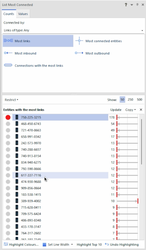
You can then click on these entries to select them in your chart and perform further analysis or start looking at where those connections lead.
You can also click the toggles at the beginning of each entity to highlight the links that run from that Entity to help you visualize on the chart what the results are telling you.
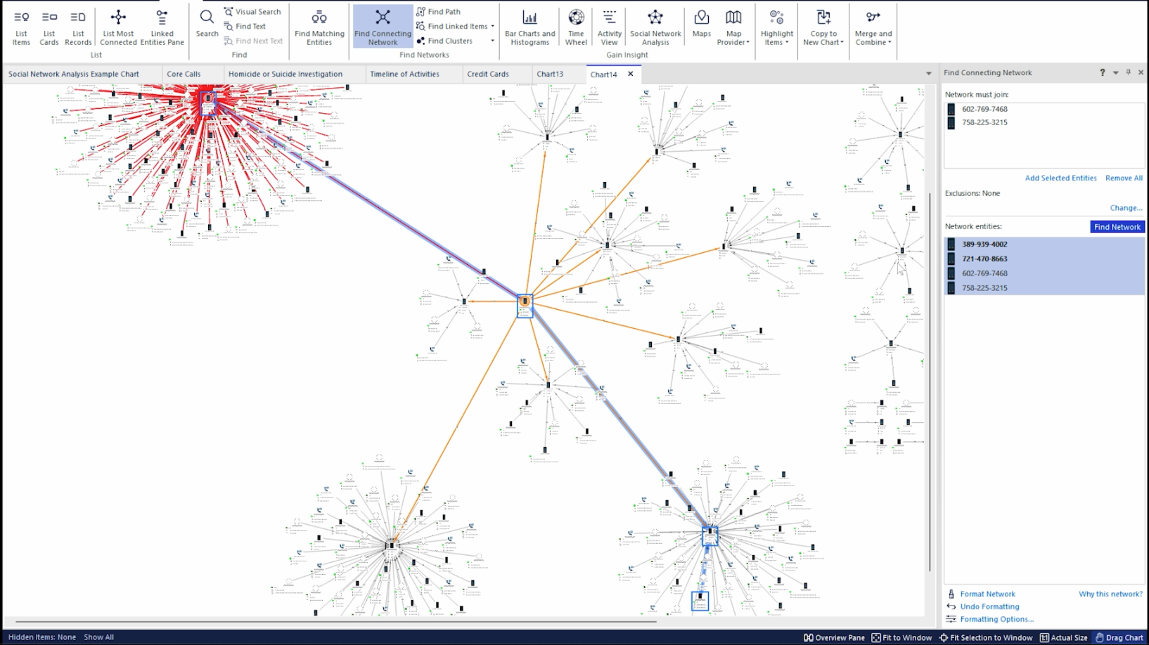
Find Connecting Network
Find Connecting Network is a tool located in the Analyze tab that can be used to identify the pathways that might connect different entities on your chart.
You can select either 2, or more, Entities on your chart and then add the selected entities using the Add Selected Entities prompt when you have the tool open. Doing this and then selecting the Find Network option will run the tool which will take a short time to find the results. If there is a connecting pathway the Entities and Links involved will be displayed in the results area below the Entity selection area. These will consist of the Entities selected and the Entities that bridge them in a list that shows the network. It will also select both the Entities and Links involved in the request on your chart to highlight the pathway if one exists.
Time Wheel
The Time Wheel, also located in the Analyze tab, is a tool that works best when your data has time and date information connected to it. It will present this data in a visual wheel form with a color intensity scale to designate frequency of occurrences in the different time ranges.
You can use the options in the tool to determine the exact parameters it uses to build the Time Wheel as well as the appearance and colors used.
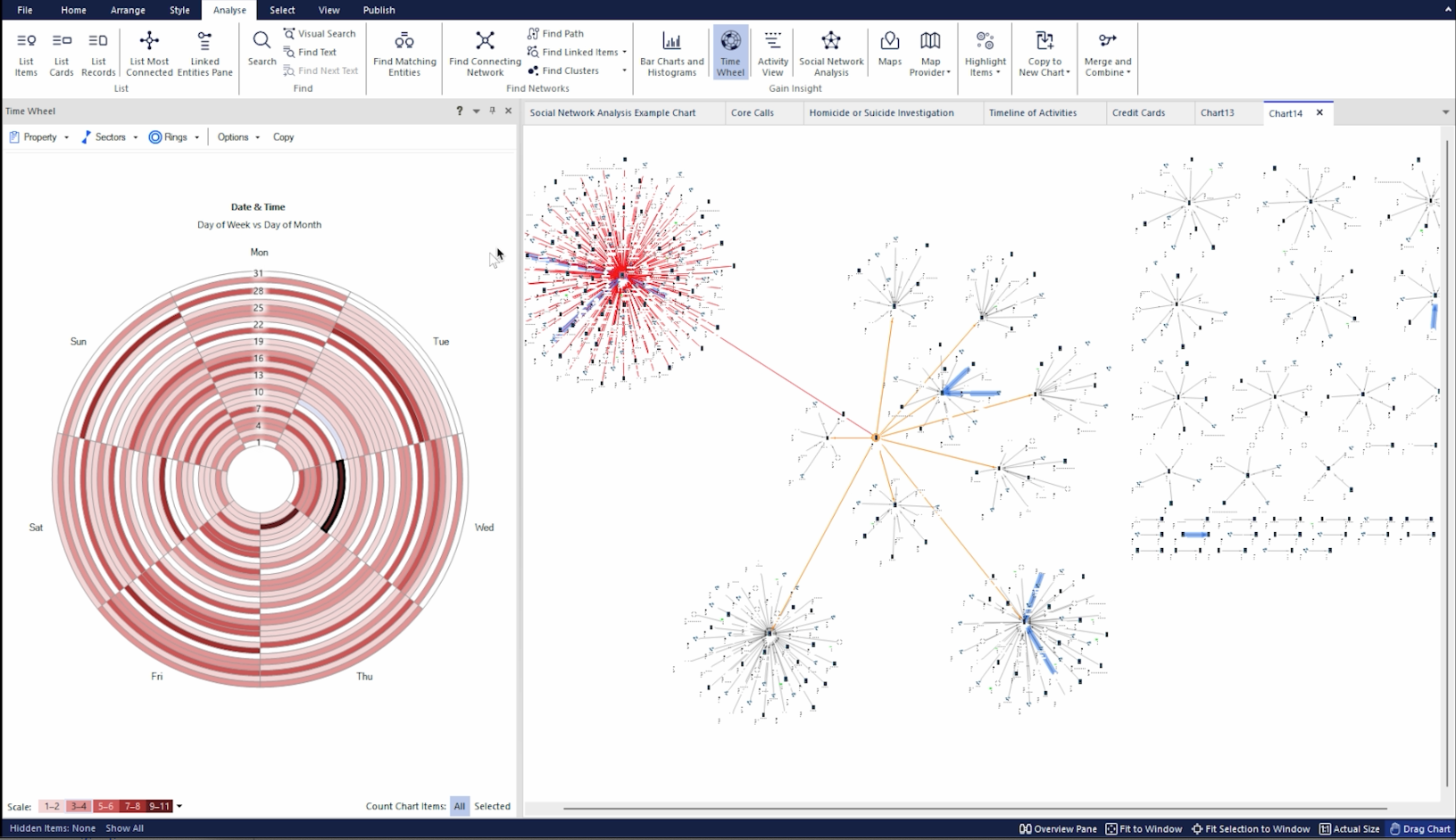
When you have selected the parameters and scale you need, you can then review the color scale to see any time periods with high activity. Selecting the different sectors will highlight all the data that occurs within that time range on your chart so you can then review that data separately and determine your next course of action.
Publish Data
After reviewing the Analyze tools, let's look at the Publish Tab which allows you to take data and charts from Analyst's Notebook Desktop and present them in different forms to people without the application or that allow you to present your data in a more condensed fashion to aid in wider understanding.
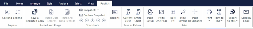
There are lots of options within the Publish tab that allow you to save copies of your chart or current view in different formats. You can export to a PDF file, save a redacted copy (this will remove or hide certain elements of the chart like entity names or attributes if things need to be confidential).
One of the tools you can use to bring information out of the application is Snapshots which is a tool that will take a capture of your current view of the chart. You can bring certain sections into focus and capture a Snapshot to help tell a story or focus on a specific area by using the Capture Snapshot option in the Publish tab.
When you have captured your desired number of Snapshots, you can click the Snapshots option above the capture button and this will open a pop-up window.
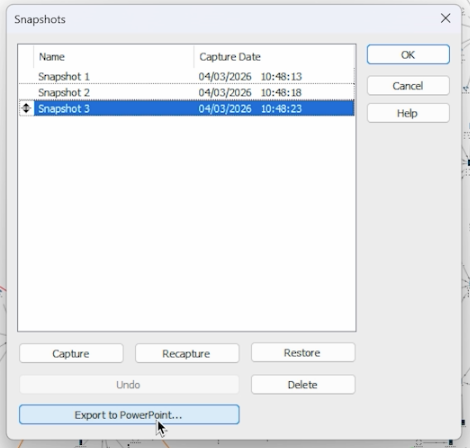
From here there's an option to Export to PowerPoint that takes each Snapshot you've captured and converts them into a presentation where each image is its own slide. You can automatically open the PowerPoint when it's created to add any additional details to your slides. This is a simple way to quickly create a narrative or flow of information to share with others.
Working with other i2 Products
Analyst's Notebook works with other i2 products such as iBase and i2 Analyze.